Calculating overlapping areas

Welcome Notes

1197

A frequently requested GIS operation for Team Tuco-tuco is calculating the overlapping areas of individually marked tucos.

First  of all, make sure you have ArcGIS. To install your own copy, request a free license as a UC Berkeley student or use a workstation in MVZ:
All the installation steps are outlined there.

In ArcGIS,
1)  import your points. If you’re not sure how to do that, see tutorials (https://mvzgis.wordpress.com/workshops/beginners-intro-to-gis/). Verify they are showing up and you can see all your attributes.
2) Calculate minimum convex hulls, which can be done with the Minimum Bounding Geometry Tool (use the search toolbar)
3) Next use the Tabulate Area tool in ArcGIS, which will create a table of results. (You will need Spatial Analyst extension enabled)
Be sure to set the Zone Id and the Class Id as the same parameter, in this case it was “tucoid”

Tip: copy the python snippet to repeat these steps for more datasets.
# Replace a layer/table view name with a path to a dataset (which can be a layer file) or create the layer/table view within the script
# The following inputs are layers or table views: “xy.shp”,”x_hulls”, “x_hulls”
arcpy.MinimumBoundingGeometry_management(“xy.shp”,  “c:/output/x_hulls.shp”, “CONVEX_HULL”, “NONE”)
arcpy.TabulateIntersection_analysis(in_zone_features=”x_hulls”,zone_fields=”x_hulls.tucoid”,in_class_features=”x_hulls”,out_table=”C:/Users/Michelle/Downloads/shapefiles/intersect_table_classtucoid.dbf”,class_fields=”x_hulls.tucoid”,sum_fields=”#”,xy_tolerance=”#”,out_units=”UNKNOWN”)
This can be also turned into a standalone python script, with more convenient variables for input and output files, if you need to go into industrial-strength analysis.

Mapping the 2010 U.S. Census – NYTimes.com

Mapping Data

Mapping the 2010 U.S. Census – NYTimes.com. I keep returning to this fine example of web mapping which the NYTimes has created for the 2010 Census results. The content is fascinating and the interface is great in performance (speed) and options. You can’t download data but that’s not the point; you can easily explore the changes in racial, ethnic and population density in the last decade. The US Census Bureau has the 2010 Census data as shapefiles available for downloading as well as many different tallies of new and changed geographic entities but no beautifully rendered interface. That remains the NYTimes’ strength.

Cal-Adapt — a new webportal for climate change research

Mapping Data

Cal-Adapt — Exploring California’s Climate Change Research.     A new website was launched today that raises the bar for visualizing and making both state-wide and local mapping possible for a variety of climate and climate parameters. Funded by the California Energy Commission (CEC), it highlights a lot of climate research products by many similarly funded or collaboratively funded climate researchers around the state.

The site and its database was developed by the Geospatial Innovation Facility (GIF) at UC Berkeley, and is both beautiful and nimble to behold. There are interactive maps where you can visualize both spatially and graphically the data and trends for climate like temperature and precipitation as well as snow pack, runoff, sealevel change and wildfire risk from 1950 through two future scenarios to 2090. Much of the raster data can be downloaded in various resolutions– quite a convenience since many are buried in technical sites (one tiny quibble although maybe I am missing something, the resolution of the downloaded data could be better displayed since it’s not immediately apparent).

In addition there is a long list of publications compiled and fully cited with links that focus on climate change issues for the state of California (although many are relevant to other regions as well). A tab for Community promises to be interesting as it has a section on Ask a Climate Expert and Historic Photo Hunt with Coming Soon! posts. The latter is something that promises to post Weislander’s landscape photos from the 1930’s for the public to try to “re-take”, an idea that the Museum of Vertebrate Zoology has been kicking around as we have a similar archive of landscape and habitat photos, of which a tiny fraction have been re-shot for the Grinnell Resurvey Project. I look forward to see their implementation of this citizen-science approach to enhance the VTM Project.

In fact the next few of my posts will be about citizen-science initiatives to harness people power for science…. coming up!

Ecosystem Modeling Tried to Predict Osama’s Possible Whereabouts – in 2009

News

“Geographers Had Predicted Osama’s Possible Whereabouts” – ScienceInsider*. I had not seen this 2009 paper that is now getting renewed interest with Osama Bin Laden’s discovery and death, which applied biogeographic theories to create a probabilistic spatial model to predict his occurrence. Thomas Gillespie and John Agnew, geography professors at UCLA, and their more enterprising undergraduate students in their remote sensing class asked biogeographic questions in light of available remote sensing data to address the probabilistic occurrence of an individual, instead of a species. Certainly a novel twist to modeling, and with incomplete but public information on their target, they formed a hypothesis.

EarthObserver – global exploration via iphone

Earth

Apparently I am on an iPhone roll here… Another rich set of GIS data from the Center of International Earth Science Information Network and others is available on your iphone from an app built by the Lamont-Doherty Earth Observatory at Columbia University. This one will require a network connection to browse through over 30 global layers of geology, geologic history (eg. ocean floor crustal age, etc), land cover and surface (eg. primary productivity of SE Asia, etc), human impact (eg. population density, human footprint index, etc) and more. As far as I can tell, it’s the same research grade collection as available on the main CIESIN website, so a fun way to preview on your mobile device what you can access in your GIS. Seems like a worthwhile $3!

GIS in your pocket – CA Geology

Mapping Data

Integrity Logic’s opening statement says it all: “What if you could hold all of California in the palm of your hand?” They have packed a lot of GIS datasets into an iphone app so you can explore California’s geology, geologic features, hydrology and much more with the usual iphone accessibility to GPS, screen capture etc. Because all the data is locally stored on your device, you are free from the wi-fi or cellular network tether and can use it in the field. The company has similar datasets in separate iphone apps for other states, such as Arizona, Washington, Oregon, Massachusetts, Georgia, Colorado, Minnesota and more.

Thanks, Pascal, for sharing this info!

iNaturalist- Explore, Record & Share your Observations

Mapping Data

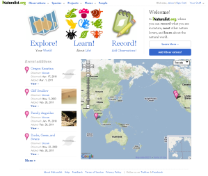
iNaturalist.orgIf you are not familiar with iNaturalist, go check it out! There is a lot of functionality here with a smooth interface that sets it apart from other citizen science websites. iNaturalist satisfies the naturalist in all of us and allows you to share and communicate with a growing community of observant nature lovers around the world.

Recently an iphone app for iNaturalist has been released so you can make your observations on the go, and post your info when you are back in wi-fi or cellular range.

A class at SFSU will start to use it to record their observations on their fieldtrips to the Angelo Reserve in northern California.

The Places feature is a great way to start cataloging observations for specific protected area and building a way to inventory and monitor species. If you don’t see a checklist for your local park, you can easily start to build it yourself.

The future of mobilized biodiversity data is here and will be exciting to see how this and other efforts to capitalize on collection data housed in natural history collections worldwide.

Google Maps Tools

Mapping Data

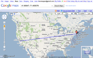
This is actually “old” news but at a recent georeferencing workshop we gave, I was in the awkward position of having an outdated slide! As posted here under the Map Tools tab, we recommend Google Maps as an efficient and easy georeferencing tool to affix coordinates to a site. Further, we used to suggest third-party mapplets to enhance these tasks. My favorites were: Lat/Long Tool, and just for fun, Dig a Hole Through Earth. I used the former a lot since you can create a nice long list of coordinates in any format you need (DMS, DD, etc) then copy/paste them all into a spreadsheet of your localities. However, Google decided to deprecate the whole program of independent developers adding in Google Maps functionality and instead shove them onto little websites of their own.

California Highways: Everything You Ever Wanted To Know Mileposts

Mapping Data
Mile Marker 0

Image via Wikipedia

California Highways: Everything You Ever Wanted To Know About Numbered Highways. “Dumb as a post” Anyone who slings that insult around hasn’t had to georeference a common locality type in natural history collections, those based on road mileage, specifically referring to milepost on the highways and byways of the US.

Recently the Georef Team had a few based on California county road mile markers: “near 14 mile marker, Carmel Valley Road, Carmel Valley” and “Mile Marker 19.5 on Carmel Valley Rd.” to list just two on the same road.  When out in the field, especially finding a noteworthy roadkill or walking along the road looking for stream confluences, it is convenient to use the landscape and mile markers to record your locality (and the GPS is packed up!), so these are far from rare in some collections. However, it’s a landmark that is not necessarily easy to georeference without a spatial database of mile markers. What? California does not have one!

Google Earth Engine

Earth, Mapping Data

Google Earth Engine. Unveiled in Cancun, Mexico, at the International Climate Change Conference, Google announced its latest planetary visualizations. From Google’s blog: ” Google Earth Engine is a new technology platform that puts an unprecedented amount of satellite imagery and data—current and historical—online for the first time. It enables global-scale monitoring and measurement of changes in the earth’s environment. The platform will enable scientists to use our extensive computing infrastructure—the Google “cloud”—to analyze this imagery.”

You can browse through different layers in the Data Catalog tab then press Open in Workspace, an adjacent tab for a Google Maps interface. The Gallery tab embeds the 3D Google Earth to view and interact with Featured Data.

I was struck by the forest cover loss in the last decade in the Congo– the product of over 8000 Landsat images!

This is necessarily collaborative, to make accessible these kinds of data, the breadth of historic remote sensing data and products from remote sensing data, and more importantly invites collaboration across many disciplines. So I am looking forward to see what happens here. Congratulations to Rebecca Moore!